Your page now has all the right pieces — a hero, features, services and an FAQ (we built those in Parts 4 and 5). But “all the right pieces” and “looks professionally designed” are two very different things. The gap between them is closed by a small set of design controls that every widget and container shares. Learn these five and you can make anything look intentional — no design degree required.
📚 Part 6 of my in-depth Elementor series (within my WordPress Plugin Guides). New here? Start with Part 1: Installing Elementor.
The Style and Advanced tabs
Select any element and the left panel shows three tabs. We’ve lived in Content so far; the magic is in the other two. Style controls how an element looks — colors, typography, backgrounds. Advanced controls how it sits — spacing, borders and finer positioning. Between them sit the five controls that do the most visible work on any page.
The five controls that do the heavy lifting
- Spacing — padding & margin (Advanced tab). The single biggest upgrade you can make. Padding is space inside an element (between its edge and its content); margin is space outside it (between it and its neighbours). Generous, consistent spacing is 80% of what makes a design feel “clean”.
- Color & typography (Style tab). Text color, font, size, weight and line height. The pro move is restraint: one or two brand colors, one or two fonts, a clear size hierarchy — and stick to them everywhere.
- Background (Style tab). Give a container a solid color, a gradient, or an image (with an overlay). This is how you create the distinct horizontal “bands” that give a long page rhythm.
- Border & border radius (Advanced tab). A subtle 1px border defines an element; rounding the corners (try 12–16px) makes cards and buttons feel soft and modern rather than boxy.
- Box shadow (Style/Advanced). A soft shadow lifts a card off the page. Keep it gentle — low spread, a fair bit of blur, low opacity — and it’s the difference between “flat” and “designed”.
💡 If you change one thing, add spacing. Nine times out of ten the reason a page looks “off” is that everything is crammed together. Increase the padding inside your containers and the space between sections, and watch the whole page start to breathe.
See it: plain vs styled
Here’s the same feature card twice. On the left, default spacing and no styling. On the right, the exact same content with padding, a background, a rounded border and a soft shadow — nothing more. Same words, completely different feel:
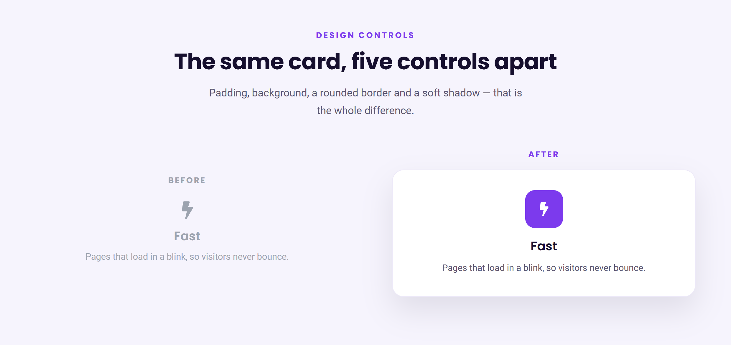
None of that required design talent — just the Style and Advanced tabs. The trick is restraint: a little padding, one background, a small radius, a faint shadow. Pile on more and it starts to look busy; this is exactly the right amount.
⚠️ Common mistake: a heavy, dark drop shadow with high opacity. Real shadows are soft and barely-there. Use a large blur and a low opacity (10–15%) so the card looks like it’s gently floating, not stamped onto the page.
✅ Try it yourself: Take one of your service cards. In Advanced, add 30px of padding. In Style, give it a white background, a 16px border radius, and a soft box shadow (large blur, ~12% opacity). Four changes — and it looks like a real product card.
🔨 Build this: Style every card on your page consistently — same padding, same radius, same shadow — then give your hero and services sections distinct background colors so each band stands apart. Publish. Suddenly the whole page looks designed on purpose.
Key takeaways
- Spacing is the highest-impact control — when in doubt, add more.
- Use backgrounds to create distinct bands; radius + shadow to make cards feel modern.
- Restraint beats decoration — a little of each control, applied consistently.
- Keep shadows soft and subtle, never heavy.
What’s next
You can now style anything — but setting the same colors and fonts by hand on every element gets tedious fast, and it’s easy to end up with five slightly different purples. In Part 7 we fix that with Elementor’s global colors and fonts: define your palette once and reuse it everywhere. Continue to Part 7 →
Prefer to skip the learning curve and just have a polished site built for you? See how I can help build your WordPress site.