More than half of all web traffic is on phones — so a page that only looks good on a desktop is a page that’s failing most of its visitors. The good news: the design you’ve already built has been quietly responsive all along. Elementor reflows things for smaller screens automatically. In this part you learn to take the wheel with device modes, fix the few things that don’t adapt on their own, and ship a page that looks deliberate on every screen.
📚 Part 8 of my in-depth Elementor series (within my WordPress Plugin Guides). New here? Start with Part 1: Installing Elementor.
Device modes: preview every screen
At the top of the editor (and in the bottom bar) sit three little icons: desktop, tablet and mobile. Click one and the canvas instantly resizes to that screen — a true preview, not a guess. Two ideas make device modes click:
- Most things adapt automatically. Text reflows, containers shrink, images scale. Often a page just works on mobile with no extra effort at all.
- Settings can be per-device. Many controls — font size, spacing, alignment, and a container’s direction — have a small device icon next to them. Change a value while in mobile mode and it applies only to mobile, leaving your desktop design untouched. This is the whole game.
💡 The number-one mobile fix: set your multi-column rows to stack. Select the row container, switch to mobile mode, and change its Direction to Column. Three side-by-side cards become a clean vertical stack — exactly what a narrow screen wants. This one change fixes the most common “it’s broken on my phone” complaint.
The same page, on a phone
Here’s the hero and feature row we built earlier, viewed at phone width. The feature row’s direction was set to Column for mobile, and the hero headline was given a smaller mobile font size — two small per-device tweaks. The result reads perfectly on a narrow screen:
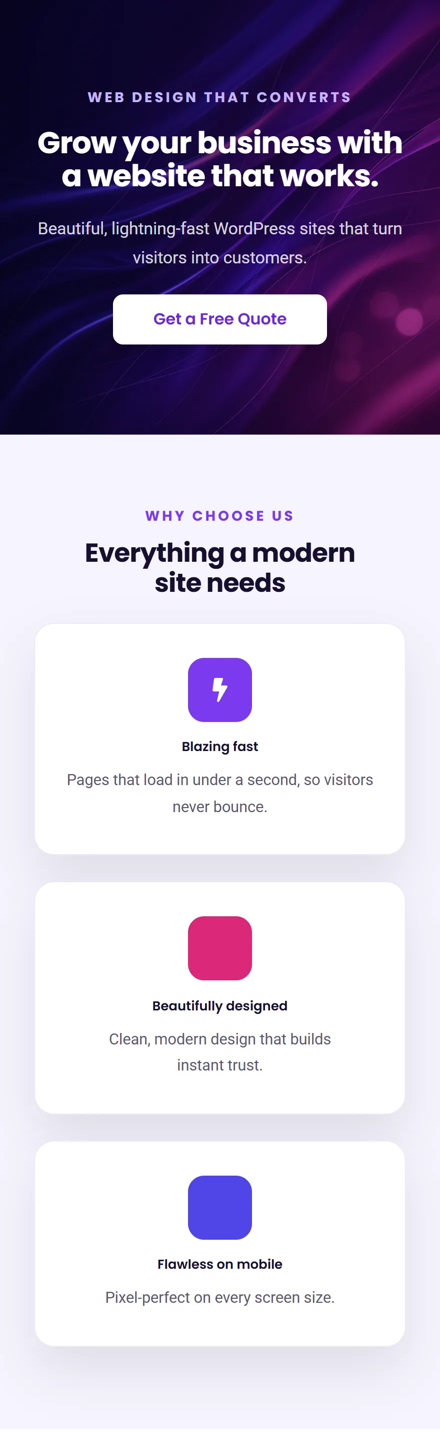
Notice we didn’t rebuild anything. The desktop layout stayed exactly as it was; we just gave mobile a couple of overrides. That’s the whole philosophy: build for desktop, then sweep through tablet and mobile fixing only what needs fixing.
Your quick mobile checklist
- Stack the rows. Any multi-column row → Direction Column on mobile.
- Shrink big headings. A 56px desktop H1 is too big on a phone — drop it to ~30px in mobile mode.
- Tighten section padding. 100px of top/bottom padding feels huge on mobile; reduce it so visitors don’t scroll through empty space.
- Check tap targets. Make sure buttons are big enough to tap with a thumb, and not crammed against each other.
- Hide what’s not needed. Under Advanced → Responsive, you can hide a purely decorative element on mobile to keep things lean.
⚠️ Common mistake: changing a value while in desktop mode when you meant to change only mobile. Always check which device icon is highlighted at the top before you start tweaking — a “mobile” change made in desktop mode will change every screen.
✅ Try it yourself: Switch your editor to mobile mode and walk down the page top to bottom. Anywhere text feels too big or things look cramped, fix it right there — it only affects mobile. Five minutes of this and your page is genuinely phone-ready.
🔨 Build this: Go through your whole page in mobile mode using the checklist above, Publish, then open the page on your actual phone. It should look like it was made for it — because now it was.
Key takeaways
- Device modes let you preview and tune each screen separately.
- Per-device settings (the little device icon) change only that screen.
- The big three fixes: stack rows, shrink headings, tighten padding.
- Always confirm which device is active before editing.
What’s next
You now have every skill you need: containers, widgets, styling, a design system and responsive control. In Part 9 we put it all together and build a complete landing page from scratch, start to finish — the payoff this whole series has been leading to. Continue to Part 9 →
Prefer to skip the learning curve and just have a polished site built for you? See how I can help build your WordPress site.