
In Part 6 you learned to style anything by hand. That’s powerful — and, on a real site, a trap. Set your brand purple by hand on forty different elements, and the day you decide to tweak that purple, you’re editing forty elements one by one. Elementor’s answer is a proper global design system: define your colors and fonts once, and every element that uses them updates everywhere, instantly. This is the habit that separates a hobby site from a professional one.
📚 Part 7 of my in-depth Elementor series (within my WordPress Plugin Guides). New here? Start with Part 1: Installing Elementor.
Where the globals live: Site Settings
Open the editor, click the hamburger menu (top-left of the panel), and choose Site Settings. Inside you’ll find two panels that quietly run your entire design:
- Global Colors — your palette. Elementor starts you with four roles: Primary, Secondary, Text and Accent. Set those to your brand colors, and add a couple of your own (a dark “ink” and a light background color are always useful).
- Global Fonts — your typography. The same idea for type: Primary (usually headings), Secondary (sub-headings), Text (body) and Accent. Pick the font, size and weight once, here.
- Global vs custom — whenever you set a color or font on any element, the picker shows your globals at the very top (with a little globe icon). Choose one of those rather than a one-off custom value, and you’ve wired that element into the system.
⚠️ The golden rule: never type a raw hex code or pick a one-off font on an element if a global will do. The moment you start hard-coding colors, you lose the superpower — restyling the whole site in two minutes — and you’re back to editing every page by hand.
See it: one palette, one type scale, the whole site
A design system is really just two short lists: a handful of colors, and a clear set of text sizes. Here’s a simple one — four color roles and a type scale from big headings down to body text. Every heading, button and accent on the site pulls from these, so changing the brand color here recolors the entire site in one move:
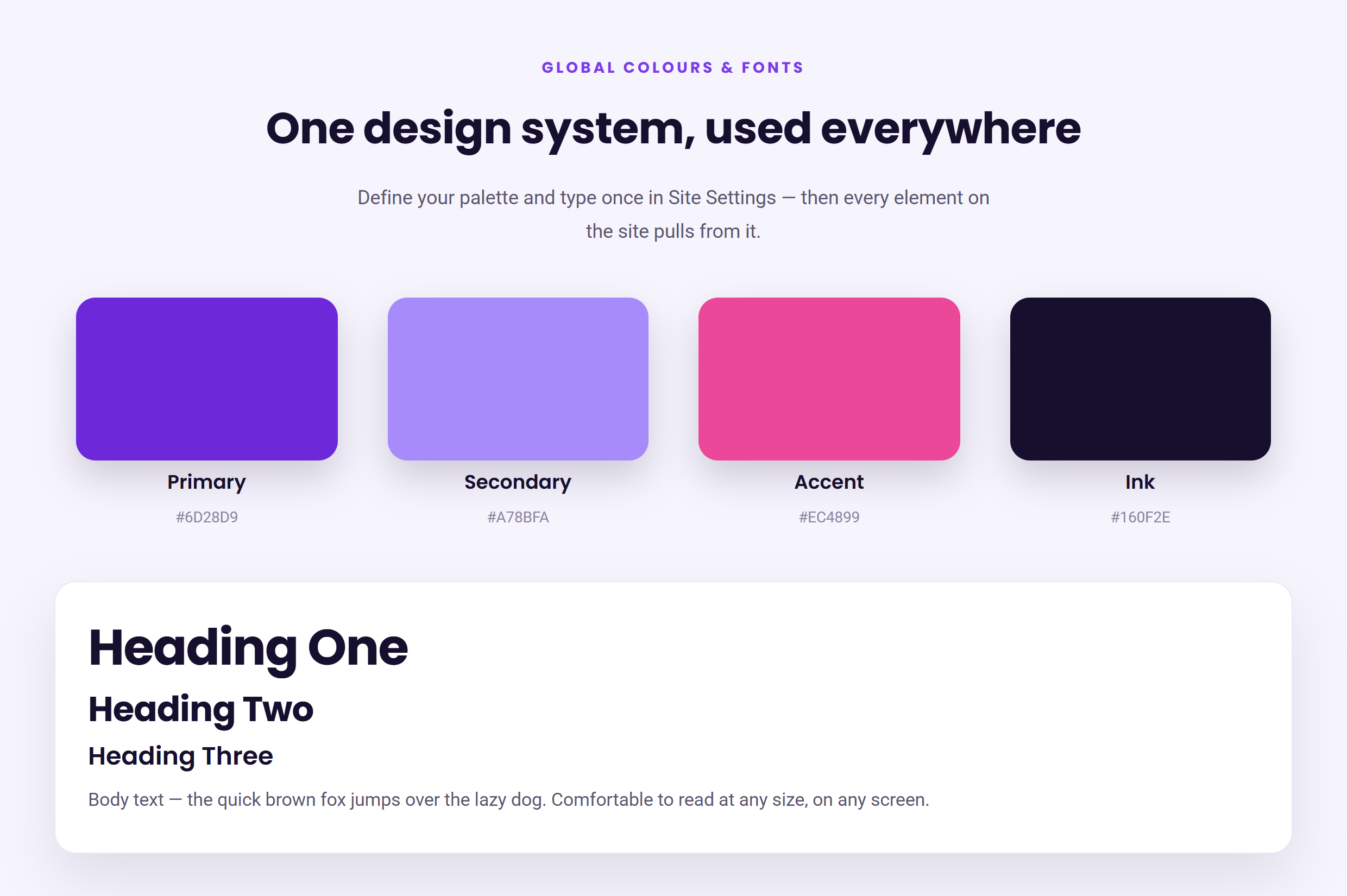
This one habit is what makes even simple layouts look considered — consistency reads as competence. And it makes future edits painless: a rebrand that would take hours of hunting becomes a two-minute job in Site Settings.
How to choose your palette and fonts
- Keep colors few. One strong brand color, one supporting color, a near-black for text, and a light background gets you a long way. Add an accent only if you need it.
- Pair two fonts at most. A characterful font for headings and a clean, readable one for body text. Elementor includes the full Google Fonts library, so you’re spoilt for choice — resist using more than two.
- Build a real scale. Decide your H1, H2, H3 and body sizes once (e.g. 48 / 32 / 24 / 17px) and apply them everywhere. A consistent scale is half of what makes type look professional.
✅ Try it yourself: Open Site Settings → Global Colors and change your Primary color. Watch every heading and button that uses it update across the whole page at once. Then change it back. That live, site-wide update is the entire point of globals — and it’s genuinely satisfying to watch.
🔨 Build this: Set up four Global Colors and three or four Global Fonts for your site, then go back through your page and re-point your headings, buttons and accents to use them. Publish. Your page now has a real, maintainable design system underneath it.
Key takeaways
- Global Colors and Global Fonts live in Site Settings — define them once.
- Always pick a global (globe icon) rather than a one-off custom value.
- Keep it tight: a few colors, two fonts, one clear type scale.
- The payoff is a whole-site restyle in minutes, not hours.
What’s next
Your page looks designed and it’s built on a tidy system. There’s one thing left before it’s truly ready for the world: it has to look just as good on a phone. In Part 8 we tackle responsive design — how Elementor’s device modes let you fine-tune the layout for tablet and mobile. Continue to Part 8 →
Prefer to skip the learning curve and just have a polished site built for you? See how I can help build your WordPress site.