In Part 3 you learned to arrange containers into any layout. Now we fill them with content. In Elementor, every piece of content — every headline, paragraph, photo and button — is a widget you drag onto the page. There are dozens, but a small handful do the vast majority of the work. Learn these four properly and you can build almost any section on any website. To prove it, we’ll use them to build a polished hero — the bold band at the very top of a page.
📚 Part 4 of my in-depth Elementor series (within my WordPress Plugin Guides). New here? Start with Part 1: Installing Elementor.
The four widgets you’ll use on every page
Drag each of these from the panel, drop it into a container, and edit it in the left panel. They are the bricks every page is built from:
- Heading — your titles. Crucially, you set the HTML tag here: H1 for the single most important title on the page, H2 for section titles, H3 for sub-points. This isn’t just visual — search engines read those tags to understand your page, so getting them right is quietly good for SEO.
- Text Editor — your body copy. A familiar mini word-processor for paragraphs, links, bold and lists. This is where the actual words live.
- Image — a photo or graphic from your Media Library. Set its size, alignment, caption, and whether clicking it opens a larger version. (Always add alt text — it helps SEO and accessibility.)
- Button — the call to action. Give it text, a link, a color and some padding. Every page should have at least one button telling visitors exactly what to do next.
Content vs Style: the rhythm that never changes
Click any widget and the left panel shows three tabs, and you’ll use the first two constantly:
- Content — what it says. The actual text, the image you chose, the button’s link.
- Style — how it looks. Color, typography, background, spacing.
- Advanced — margins, padding, and finer positioning (we lean on this from Part 6 onward).
That’s the entire rhythm of building in Elementor: drag a widget in → set its words in Content → set its look in Style. Heading, text, image, button — same three steps every single time. Once it’s muscle memory, you stop thinking about the tool and start thinking about the design.
Build it: a hero section
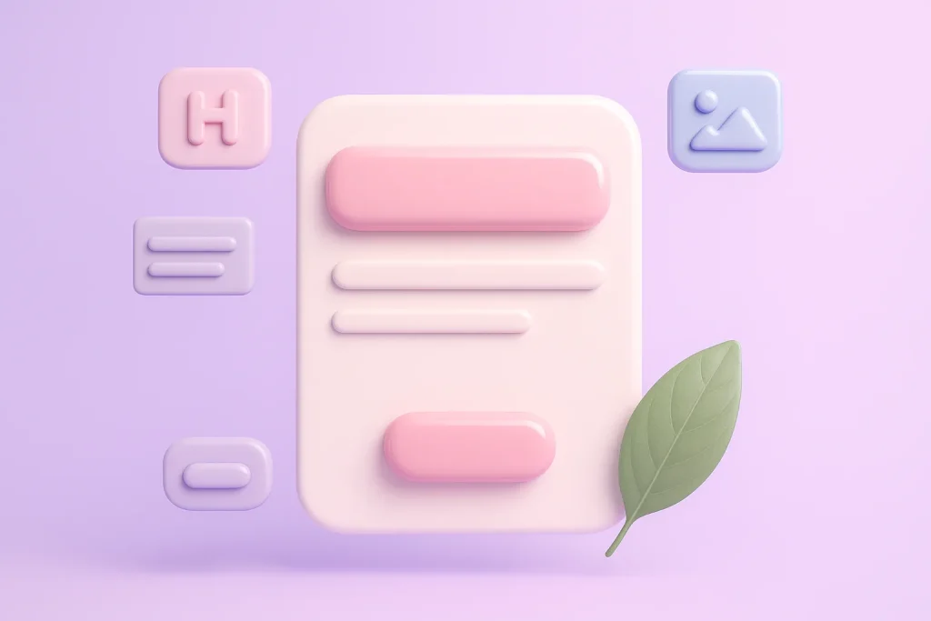
A hero is the first thing a visitor sees — a big headline, a line of supporting text, and a button, usually on a strong background. It’s the highest-value real estate on your whole site, and it’s the perfect place to practise these four widgets. Here’s the kind of hero we’re building:

Build it in five moves:
- Add the band. Drop a container at the very top of the page (Direction Column, Align Items Center). In Advanced → Padding give it 100px+ top and bottom so it feels generous, not cramped.
- Give it a background. In the container’s Style → Background, choose a color or gradient — or an image. If you use a photo, add a Background Overlay (a semi-transparent dark color) so white text stays readable. This one trick separates amateur heroes from professional ones.
- Add the Heading. Set it to H1, type your headline, bump the font size right up (40–60px), set it bold, color it white, and center it. Make it about the visitor’s outcome, not your company name.
- Add a Text widget beneath it for one supporting sentence — slightly smaller, a touch softer in color, and capped at a comfortable reading width.
- Add a Button. Label it with an action (“Get a Free Quote”, not “Submit”), give it a link, a strong color, padding around 16×40px and a small corner radius. Done — a complete, professional hero.
And that’s the deep secret of page building: most sections are just these four widgets, arranged in containers, dressed up with a little style. Swap the Text for an Image-and-text split and you’ve got a feature section. Drop three of them in a row and you’ve got the layout from Part 3. Same bricks, endless buildings.
⚠️ Common mistakes: using more than one H1 on a page (there should be exactly one), labelling buttons “Click here” or “Submit” instead of the action, and putting white text on a busy photo with no overlay. Fix those three and your hero already outperforms most small-business sites.
✅ Try it yourself: Select your Button and open the Style tab. Change its background color, then its hover color, then its corner radius. Watch it update live. Three tiny changes and it already feels like your brand — that’s the power of the Style tab.
🔨 Build this: Add the hero to the top of your page, above the feature row from Part 3, then Publish. Your landing page now has a strong opening and a feature section — two of the building blocks every good page needs.
Key takeaways
- Four widgets — Heading, Text, Image, Button — build the majority of every page.
- Use the Content tab for words, the Style tab for looks — every time.
- One H1 per page; always add a background overlay behind text on photos.
- Write buttons as actions, not “Submit”.
What’s next
With four widgets you can already build a real page. In Part 5 we add the widgets that bring pages to life — icon boxes, tabs, accordions, carousels, testimonials and counters — and add a services block and an FAQ to our page. Continue to Part 5 →
Prefer to skip the learning curve and just have a polished site built for you? See how I can help build your WordPress site.