If there’s one place beginners get stuck in Elementor, it’s layout — getting things to sit next to each other instead of stacking in a sad vertical line, lining them up neatly, and spacing them so the page breathes. In Part 2 we learned that every page is a stack of containers filled with widgets. This part is all about the containers — specifically Flexbox containers, the single most important layout tool in Elementor. Master the handful of controls below and you can build literally any layout you can picture. By the end you’ll have built a real three-column feature row from scratch.
📚 Part 3 of my in-depth Elementor series (within my WordPress Plugin Guides). New here? Start with Part 1: Installing Elementor. Every screenshot is a real Elementor build.
What a Flexbox container actually is
In the widgets panel you’ll find an element called Container (in the newest editor you’ll also see Flexbox and Div block). Whatever it’s labeled, it’s the same idea: an invisible box that holds other things and decides how they’re arranged. “Flexbox” is borrowed from the CSS technology underneath — but you never write a line of code. Elementor turns the whole thing into a few friendly toggles.
Here’s the mental model that makes everything click: a container lays its children out along one direction at a time. Either in a row (side by side) or a column (stacked top to bottom). That single choice is what lets you put three feature cards next to each other, center a button, or stack a heading above a paragraph. Once you internalize “everything is a container pointing in a direction”, layout stops being a fight and becomes a series of small, obvious decisions.
Row or column: the one decision that defines a layout
When you add a container and select it, the very first control in the Layout section is Direction, shown as four little arrows. The two you’ll use constantly:
- Column (arrow pointing down) — children stack vertically. This is the default, and it’s what you want for most sections (a heading above text above a button).
- Row (arrow pointing right) — children sit side by side. This is how you make columns: a three-card feature row, a logo strip, an image beside text.
That’s the whole trick to “how do I put things next to each other?” — put them in a container and set its Direction to Row. No columns plugin, no fiddly widths, no CSS floats. Flip it back to Column and the same elements stack again. We’ll use exactly this to make our feature row responsive in Part 8.
The four controls that do 90% of layout
Select any container, open the Layout tab, and you’ll meet four controls. Learn these and you’ve learned layout in Elementor:
- Direction — row or column, as above. Picks the axis everything lines up along.
- Justify Content — how children are spaced along the direction. Start, Center, End, or Space Between (push items to the edges with even gaps between). For a centered row of cards, choose Center.
- Align Items — how children line up across the direction. Set this to Stretch and three cards of different text lengths all become the same height — the secret to tidy card rows.
- Gap — the space between children, set with a single number (no juggling margins). 20–30px is a comfortable starting point for cards.
💡 Say it like a sentence: “Lay these out in a row (Direction), centered (Justify), all the same height (Align), with a 24px gap.” Four words, and you’ve described almost any layout on the web.
Build it: a three-column feature row
Let’s build the classic “Why choose us” section — three feature cards side by side. You’ll reuse this exact pattern on almost every site you ever make. Here’s the finished result we’re aiming for:
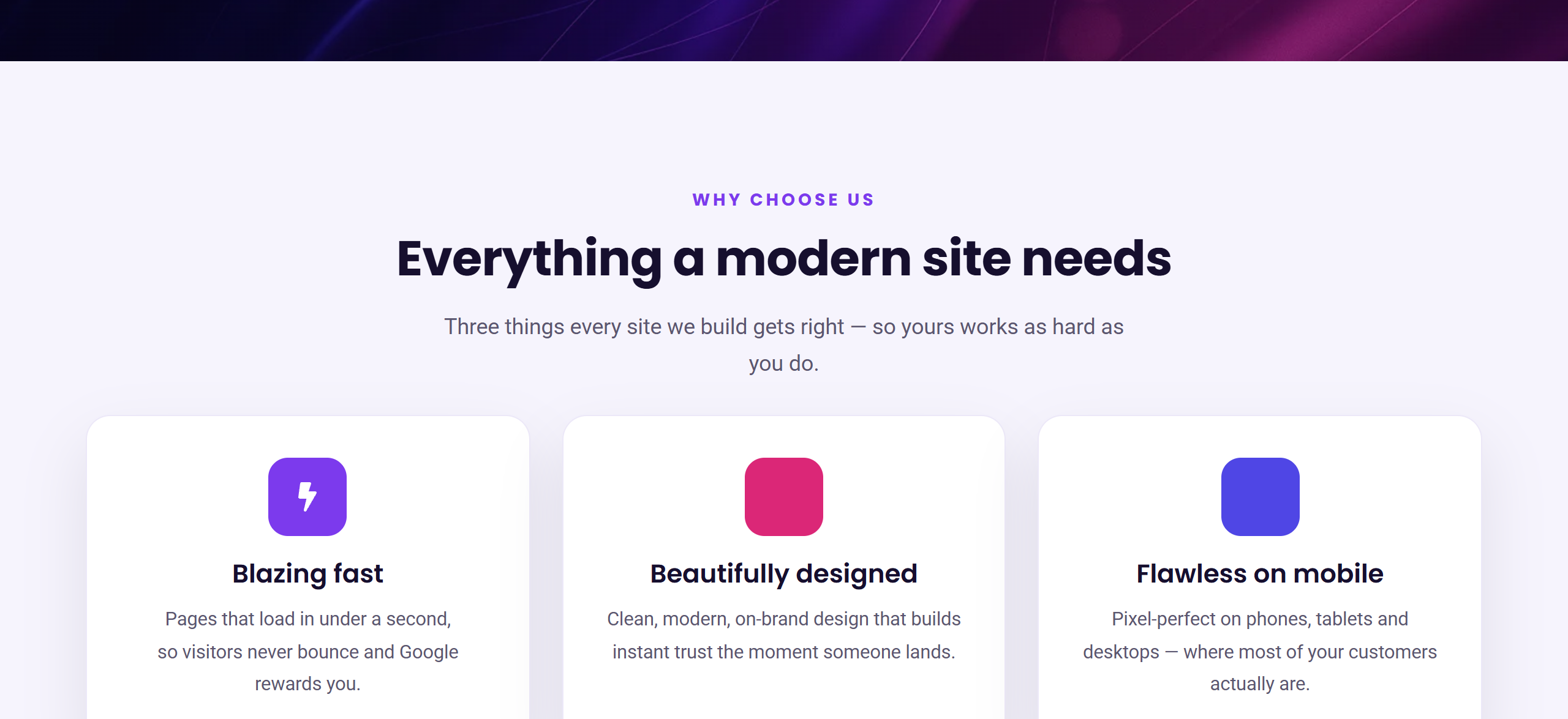
Follow these steps and you’ll have it in a couple of minutes:
- Add the section wrapper. Drag in a Container, leave its Direction as Column, and give it some breathing room — in Advanced → Padding, set 60px top and bottom. Drop a Heading inside it (“Why Choose Us”) and center it.
- Add the row. Below the heading, drag in a second container and set its Direction to Row. This is the container that will hold your three cards.
- Set the spacing. On that row: Gap = 24px, Justify Content = Center, Align Items = Stretch (so all three cards finish the same height, no matter how much text each one has).
- Build one card. Drop a third container inside the row (Direction Column, Align Items Center). Add an icon, a title (e.g. “Blazing fast”) and a line of text. Then style the card in the panel: a white or light Background, Padding of around 30px, a Border Radius of 16px, and a soft Box Shadow. (We go deep on these style controls in Part 6.)
- Duplicate it. Right-click the finished card and choose Duplicate twice, then edit the copies. Three cards, equal widths, perfectly spaced — no math required.
Notice what you didn’t do: no floats, no grid framework, no CSS. The row container spaced and sized the cards for you the instant you chose Row + Gap. That is the entire point of Flexbox containers, and it’s why they replaced the old “sections and columns” system in Elementor.
⚠️ Common mistake: setting a fixed pixel width on each card (like 350px) so they break awkwardly on smaller screens. Don’t. Let the cards size naturally and lean on Gap + Justify instead — or give each a percentage width (say 31%). Fixed pixel widths are the number-one cause of layouts that look broken on a laptop that isn’t exactly the size yours is.
Nesting: containers inside containers
Here’s where it gets powerful. A container can sit inside another container. That’s how you build anything beyond a simple row: an image-and-text section is a Row container holding two Column containers; a pricing table is a Row of Column “cards”, each with its own stacked content. You’re never limited to one layout — you nest a row inside a column inside a row until the structure matches the design in your head. Keep the Navigator open while you do it and you’ll always see exactly where you are.
✅ Try it yourself: Select your row container and flip Direction between Row and Column, then drag the Gap slider up and down and watch the cards rearrange live on the canvas. Two minutes of playing with those two controls will teach you more than any amount of reading.
🔨 Build this: Save the three-column feature row you just made — we’ll keep adding to this page as the series goes on, and by Part 9 it grows into a complete landing page. Hit Publish so your work is safe.
Key takeaways
- Every layout is just containers pointing in a direction (row or column).
- Direction, Justify, Align and Gap handle around 90% of everything you’ll build.
- Use Align Items: Stretch for equal-height cards, and avoid fixed pixel widths.
- Nest containers to build any structure you can imagine.
What’s next
You can now arrange anything on a page. In Part 4 we fill those containers with the essential widgets — headings, text, images and buttons — and build a proper hero section to sit on top of this feature row. Continue to Part 4 →
Prefer to skip the learning curve and just have a polished, fast site built for you? See how I can help build your WordPress site.