In Part 1 we installed Elementor and opened the editor for the first time. Before we start designing in earnest, let’s slow down for one short, important lesson: how the editor is laid out, and how an Elementor page is actually built. This is the conceptual foundation the whole series rests on — get it straight now and everything that follows clicks into place instead of feeling like a pile of disconnected buttons.
📚 Part 2 of my in-depth Elementor series (within my WordPress Plugin Guides). New here? Start with Part 1: Installing Elementor.
The three areas of the editor
The Elementor editor looks busy at first, but it’s really just three areas. Once you can name them, you’ll never feel lost:
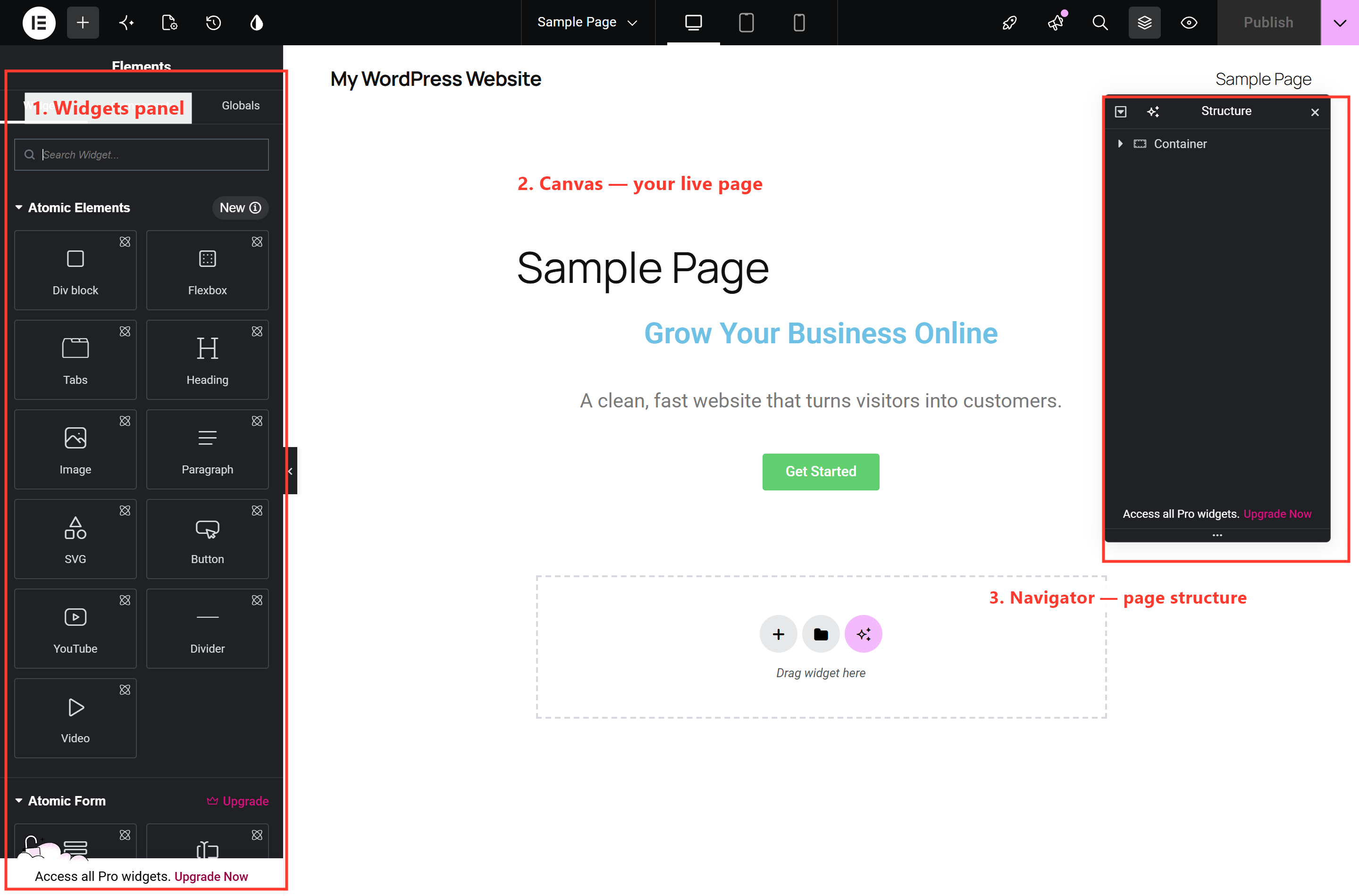
- 1. The widgets panel (left). Your toolbox. Every element you can add — headings, images, buttons, and so on — lives here, and you drag from this panel onto the page. When you select something, this same panel switches to show that element’s settings. Click the grid icon at the top-left any time to get back to the full widget list.
- 2. The canvas (middle). A true, live preview of your page. What you see here is what your visitors get — no guesswork, no separate “preview” step.
- 3. The Navigator (right). A collapsible outline of everything on the page. Think of it as the page’s table of contents — we’ll come back to it in a moment, because it’s a lifesaver once a page gets busy.
Along the bottom is a slim bar with quick access to Site Settings, the Navigator toggle, responsive mode, the page settings, history (undo/redo), and the green Publish button. You’ll reach for that bar constantly, so it’s worth a few seconds learning where each icon is.
How a page is built: containers and widgets
Here’s the single most useful idea in all of Elementor. Every page is made of just two kinds of things:
- Widgets — the actual content: a heading, a paragraph, an image, a button, an icon box.
- Containers — the invisible boxes that hold widgets and arrange them. A container is what lets you put three things side by side, center a button, or give a section a colored background.
That’s it. Widgets go inside containers, and containers can sit inside other containers when you need more complex layouts. A typical “section” of a page — say a hero with a headline, some text and a button — is one container holding three widgets. A three-column feature row is one container (set to a row) holding three more containers, each with its own content. Once you see pages as containers holding widgets, you can deconstruct any website you admire just by looking at it.
💡 The mental model: a page is a stack of containers (the rows and sections), each filled with widgets (the content). Master containers — which is exactly what Part 3 is about — and you can build any layout you can picture.
The Navigator: your page’s blueprint
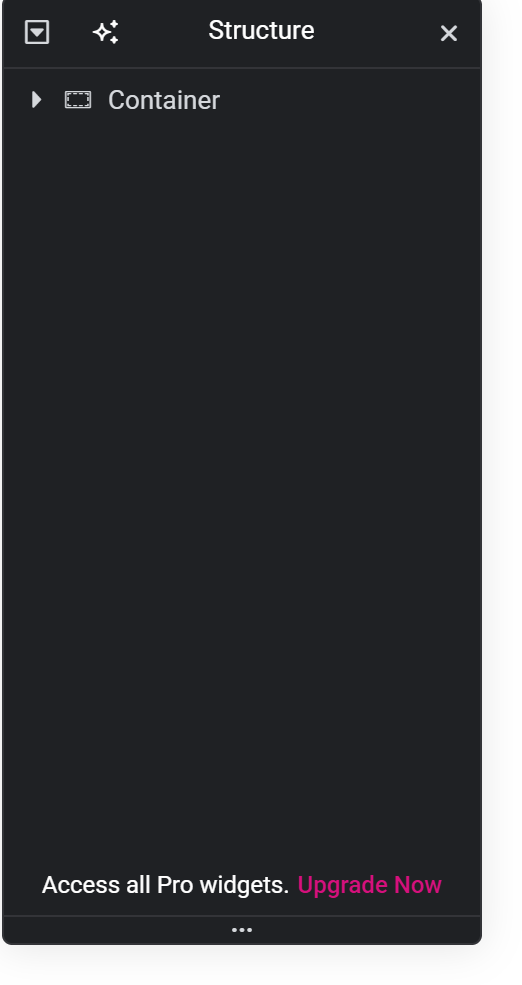
The Navigator (the panel on the right, also openable from the bottom bar) shows that container-and-widget structure as a simple tree. Click anything in the tree and it selects on the page; drag items to reorder them. On a real page with a dozen sections, this is how you stay in control — especially when you need to select a container hiding behind its own content, which is fiddly to click directly on the canvas.
Selecting and editing anything: the three tabs
To edit any element, just click it — on the canvas or in the Navigator. The left panel instantly switches from the widget list to that element’s settings, organized into three tabs you’ll use constantly:
- Content — the actual text, image, or link. What it says.
- Style — colors, typography, spacing, backgrounds. How it looks.
- Advanced — margins, padding, borders, and finer positioning. How it sits. (We’ll lean on this from Part 6 onward.)
And when you’re happy, the controls along the top let you preview the page on tablet and mobile, and the green Publish button pushes it live. That’s the entire rhythm of Elementor: select → edit in the panel → publish. Right-clicking an element gives you a handy menu too — copy, paste, duplicate, and (later) save as a template.
⚠️ Beginner trap: clicking and accidentally selecting a widget when you meant to select its container (or vice versa). When that happens, don’t fight the canvas — jump to the Navigator and click the exact item you want. It’s always unambiguous there.
🔨 Build this: Open a page in Elementor, then open the Navigator. Click each item and watch it highlight on the canvas. Now click a heading, switch to the Content tab, and change its text; switch to Style and change its color. Hit Publish. You just edited a live page through its structure — the exact skill the rest of this series builds on.
Key takeaways
- The editor is three areas: widgets panel, canvas, Navigator.
- Every page is containers holding widgets — that’s the whole model.
- Select anything, then use the Content / Style / Advanced tabs.
- When the canvas fights you, the Navigator always wins.
What’s next
You now know the editor and the container-and-widget model that every Elementor page is built on. In Part 3 we get hands-on with Flexbox containers — the real engine of layout — and build a proper three-column feature row from scratch. Continue to Part 3 →
Prefer to skip the learning curve and just have a polished site built for you? See how I can help build your WordPress site.