By now (after Part 4) you can build a page from headings, text, images and buttons. Those four take you a long way — but the sections that make a site feel genuinely modern usually lean on a second tier of widgets: the ones that organize information neatly and add a touch of interactivity. In this part we meet the most useful of them, learn when to reach for each, and add a real services block and an FAQ to our growing page.
📚 Part 5 of my in-depth Elementor series (within my WordPress Plugin Guides). New here? Start with Part 1: Installing Elementor.
The widgets that bring a page to life
Here are the workhorses you’ll reach for again and again. Each is a single widget you drag in — no code, just settings — and each solves a specific job:
- Icon Box — an icon, a title and a line of text, bundled into one tidy widget. The go-to for listing services or features in a neat row (we’ll use three in a moment). It saves you wiring up three separate widgets every time.
- Image Box — the same idea, but with an image instead of an icon. Perfect for team members, products, or blog-style cards.
- Tabs — pack a lot of content into a small space by splitting it across clickable tabs. Great for “Overview / Features / Pricing” without a wall of text.
- Accordion & Toggle — expandable rows. The number-one choice for an FAQ, because visitors open only what they care about and the page stays calm.
- Image Carousel — a sliding gallery, ideal for portfolios, product shots, or a strip of client logos.
- Testimonial — a styled customer quote with a name and photo. Instant social proof, and proof sells.
- Counter — an animated number that ticks up (“500+ projects delivered”). A fun, credible way to show off stats.
⚠️ Don’t over-reach: a page doesn’t need every widget. Cramming in tabs and a carousel and counters and a toggle makes a page feel like a demo, not a business. Pick the two or three that genuinely help your visitor — usually an icon-box row for services and an accordion for questions — and leave the rest.
Build it: a services row with Icon Boxes
An Icon Box bundles an icon, a heading and a description into one widget — so a three-service row that would otherwise take a dozen widgets becomes just three. Drop three into a row container (the exact layout skill from Part 3) and you get a clean, professional services section like this:
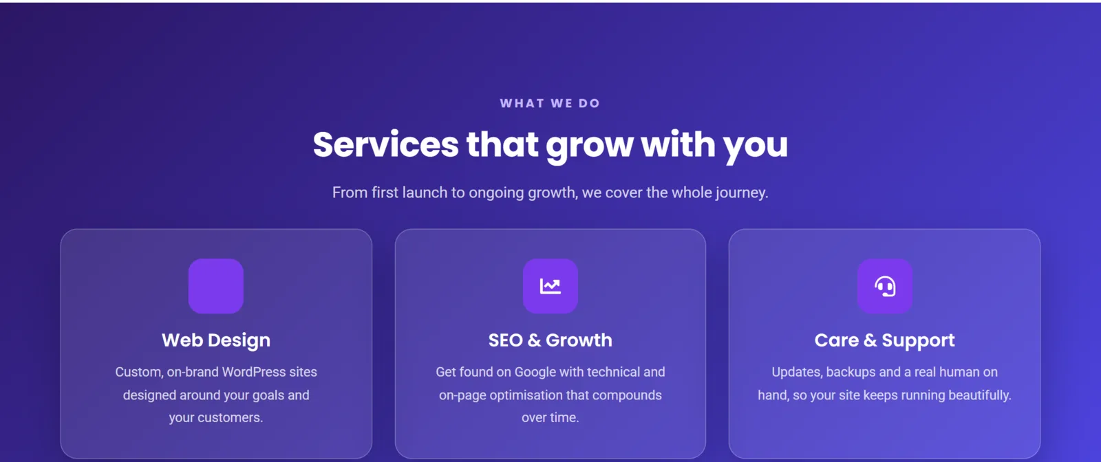
To build it: add a row container, drag in an Icon Box, then in the Content tab pick its icon, type a title and a short description. In the Style tab, set the icon color and size. Then duplicate it twice and edit the copies — three services, perfectly aligned, in under two minutes. Because every box’s icon, colors and spacing are editable, it’s easy to match your brand exactly.
Build it: an FAQ with the Accordion
An FAQ is the single best use of the Accordion widget. Visitors see a short list of questions and click only the ones they care about, which keeps the page scannable and answers objections before they become reasons not to buy. Add an Accordion, then add one item per question — the question goes in the title, the answer in the content. In the Style tab you can set the active color, the open/close icon, and the spacing.
A small but powerful detail: think about which question is most reassuring and consider leaving it open by default, so the first thing a hesitant visitor sees is an answer that builds confidence.
✅ Try it yourself: Add an Accordion with three questions, then change which row is open by default and switch the open/close icon from a plus to a chevron. Small touches like these separate a polished FAQ from a default-looking one.
🔨 Build this: Add a three-Icon-Box services row and an Accordion FAQ to your page, then Publish. Your landing page now has a hero, a feature row, a services section and an FAQ — it’s genuinely starting to look like a real website.
Key takeaways
- Icon Box = the fastest way to a clean services or features row.
- Accordion = the right widget for an FAQ; Tabs for compacting longer content.
- Testimonials and counters add credibility — use them where proof matters.
- Restraint wins: two or three well-chosen widgets beat a page full of gimmicks.
What’s next
Your page now has all the right parts. In Part 6 we make them beautiful: the design controls every widget and container shares — spacing, colors, backgrounds, borders and shadows — the settings that turn a plain page into a polished one. Continue to Part 6 →
Prefer to skip the learning curve and just have a polished site built for you? See how I can help build your WordPress site.