
From brief to launch.
The end-to-end process behind LCG Canada — strategy, design, clean WordPress development, performance, and a smooth handover.
-
01
The brief
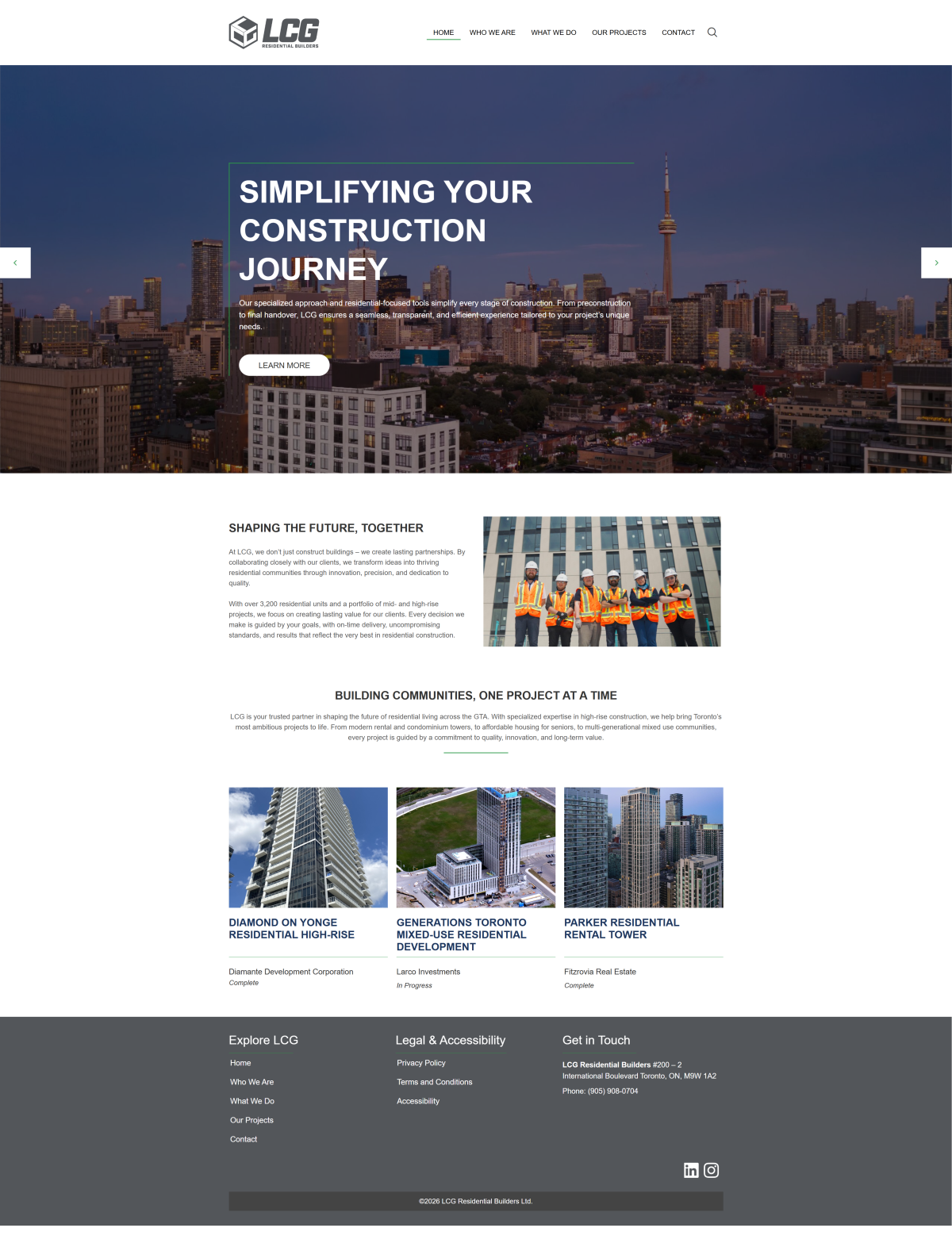
LCG Residential Builders came to me needing a corporate site that could stand beside the Toronto developers it builds for, so I let credibility drive every call: a dusk skyline hero, the 3,200-unit track record, and flagship towers like Diamond on Yonge shown with their build status.
-
02
Strategy & Wireframing
I kept the structure to five sections — Home, Who We Are, What We Do, Our Projects, Contact — and let rotating positioning statements ('Simplifying Your Construction Journey', 'A Partnership You Can Count On') carry the message with the project grid one scroll below.
-
03
Design & Branding
Charcoal greys with a single green accent taken from LCG's cube logo; I framed the hero headline in a thin green keyline over the Toronto skyline photo and kept the project cards plain white so the tower photography does the talking.
-
04
Development & Integration
In WordPress I built the multi-slide hero, a projects grid that credits each tower's developer — Diamante, Larco, Fitzrovia — and flags it Complete or In Progress, and a three-column footer separating Explore LCG links from the Legal & Accessibility policies.
-
05
Responsive & Speed
On phones the menu collapses into a green hamburger square, the 'A Partnership You Can Count On' slide restacks its paragraph under the headline, and I kept the slider arrows as large white touch blocks on either side of the frame.
-
06
Launch & Delivery
The site I handed over runs at lcgresidential.ca as LCG's proof of work: a developer can read the hero promise, check the 3,200-unit record and jump into a completed tower like Parker Residential in two scrolls.
Want a site like LCG Canada?
The exact process you just read, pointed at your business — and you own the result outright.
More work.
Three more WordPress builds, shuffled fresh each visit — every one live and owned by the client.

Kingsville Laundromat

Expert Witness in Construction